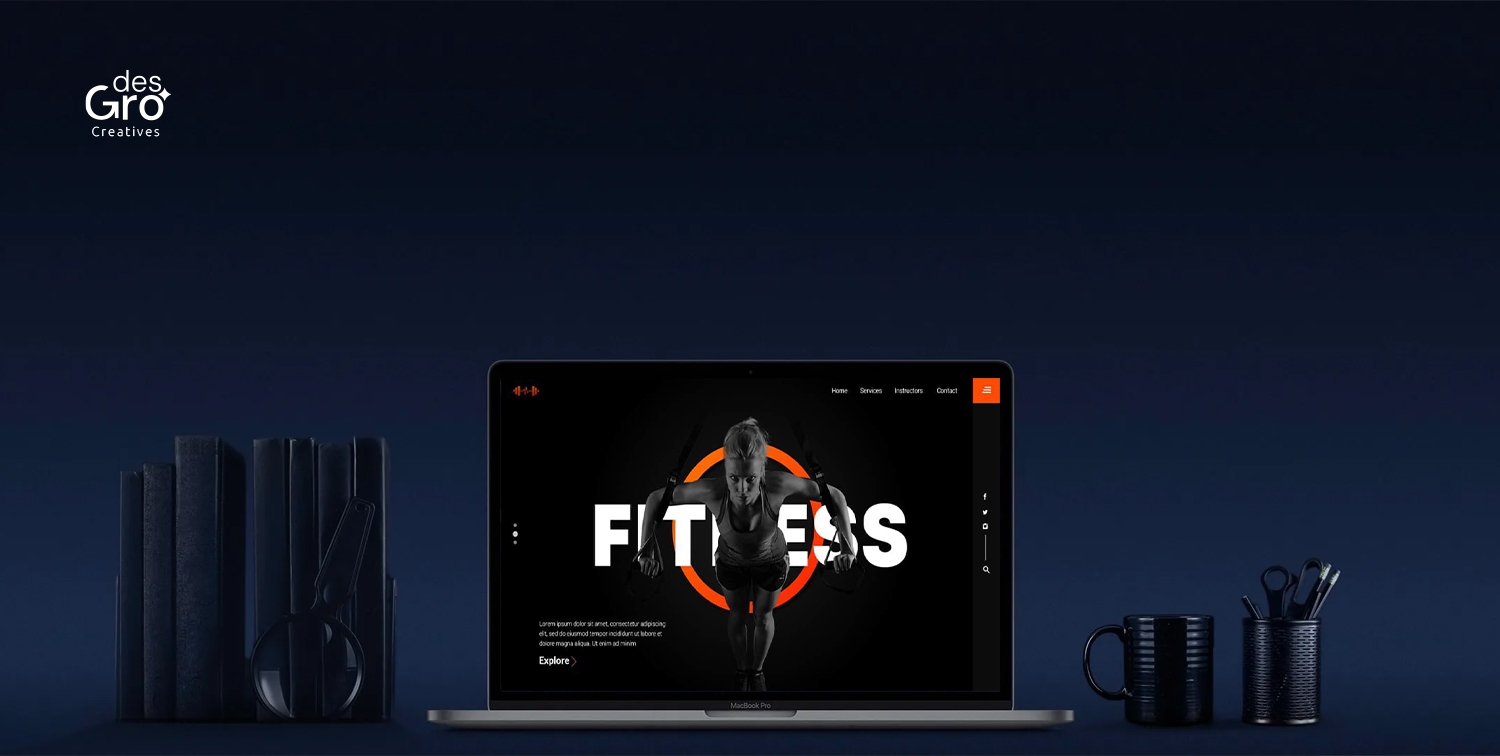
In recent times, a new stylistic theme has been dominating our screens. Most of us have adapted our eyes to this new theme of “darkness”. This transformative switch in the digital realm has been developed into a design aesthetic that is being embraced by both developers and consumers. While looking back, we realize that the idea of ‘dark screen’ isn’t as new as we think it is. In the beginning stages of computers, the screens displayed white or green letters on dark backgrounds. This was replaced with the white background and black text afterwards to give us the impression of a book, which gradually became our standard for digital screens. Thus, this “new” is actually a kind of reversion to the past.
The dark mode, also known by different names like – black mode, dark theme, etc., is now becoming the new normal in the digital space.
What exactly was the reason for this revival?
In the experiment of effectively streamlining the digital platforms, designers are going above and beyond. With our shifting perceptions of the norms, there appears more space for exploration. And these experimentations became the reason for the revival of the black background. Apart from apps, designers are using the dark mode in websites and web designs prevalently.
Dark mode designs are beyond simple graphic trends. It represents the revolutionary method of achieving digital efficiency and aesthetics.
Evaluating various facets of ‘dark mode’ in web designing
- Aesthetic charm
The dark mode enables the achievement of visual appeal on the websites easily. Black has always been akin to elegance. There is this aura of sophistication that black creates, and using that in your web page design can absolutely elevate its standards. A sense of modernity is often associated with darkness, which helps build intrigue.
- Highlighting images
If you have a web page with numerous images, a black or dark background helps highlight them, unlike light or white backgrounds. This helps you capture your viewers’ attention if you are trying to communicate with them by means of the images.
- Emotional surge
Black color is psychologically linked with a sense of ambiguity or mystery. This ultimately makes viewers connected to the content on an emotional level, as they end up being convinced that it has more to it. The aspects of elegance, flair, and power of the content also manifest in the viewers' minds under the influence of the dark mode.
- Customization
Different users have different preferences, and the introduction of this mode has been a game changer for viewers with light sensitivity. They surely will be more comfortable using the dark mode than they ever have been with the light background. Those who are comfortable with the light background can continue with that too.
- Total convenience
This particular mode radiates advantages to the viewers on varying levels as well. The dark background had noticeably reduced the strain in the viewers’ eyes, as it limits the glare on the screen, making viewing the screen more comfortable. Through this mode, the blue light exposure can be controlled, reducing factors like anxiety, insomnia, and stress in viewers. Apart from this, as the emitted light is considerably low, dark mode helps in reducing battery usage and thus builds an energy-efficient, eco-friendly digital experience.
- Restricted readability
If your website mostly contains written texts, the dark theme might not turn out to be a great option for you. Individuals with visual impairments like astigmatism or myopia are said to experience halation while reading light-colored texts on dark backgrounds. The white letters might appear blurred for such viewers.
- Challenges in designing
Though they are supposedly visually appealing, working with dark themes could end up being quite troublesome for designers. The color contracts or color schemes and their handling could be quite challenging. But overcoming these challenges might result in new milestones in innovation.
Dark mode designs are beyond simple graphic trends. It represents the revolutionary method of achieving digital efficiency and aesthetics. Its transition from an unusual substitute to a popular design option shows how viewers’ varied demands and preferences are becoming increasingly understood. A dynamic interaction of darkness and light will likely exist in digital platforms in the future, resulting in a more encompassing and visually appealing digital landscape, as designers and developers continue to push boundaries within the dark mode structure. This could possibly be converted into a classic remedy to elevate the degree of a website when skillfully utilized.


